Wednesday, April 27, 2011

Illusion of Motion by Multiple Image (46)


This a project we did in my drawing class with gesso and charcoal on board. Because of the multiple images of the shoe in different angles and clarity, the shoe looks as if it is coming towards the viewer in a sweeping motion. If it were just one shoe, there would not be any evidence of any movement within the piece.

Illusion of Motion by Blurred Outline (45)


In this picture, there are children swinging but their features are blurred out by their movement. This creates the illusion of motion. When an artist blurs what are usually sharp features into one direction, the result is the subject looking as if it were moving.

Illusion of Motion by Repeated Figure (44)

Repeated figure: a compositional device in which a recognizable figure appears within the same composition in different positions and situations so as to relate a narrative to the viewer.

This is a golfer repeated in different positions but in the same spot. This creates the illusion of motion even though it is many different pictures but on top of each other.

Anticipated Motion (43)

The implication of movement on a static two-dimensional surface caused by the viewer's past experience with a similar situation is anticipated motion.


This cat is getting ready to pounce. It is known through experience that when they get into this kind of position, they will pounce soon. This is anticipated motion because the viewers are waiting for the cat to move.

Spatial Puzzles (42)

Equivocal space: an ambiguous space in which it is hard to distinguish the foreground from the background. Your perception seems to alternate from one to the other.
In order to use this technique, artists have developed transparency in which overlapping forms appear to be transparent.
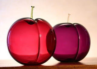
For example: both these apples are clear and where they overlap, the colors darken.


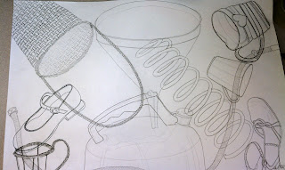
In this contour drawing, everything is drawn through each other which creates confusion to the viewer as to what lies on top and what does not.

Multiple Perspective (41)

Looking at a figure or an object from more than one vantage point simultaneously is called multiple perspective.


In this painting, the features of the women are taken from different perspectives. This is why their eyes, noses, ears, etc. all look like odd and in the wrong place. This gives the viewer a conceptual view of forms.

Amplified Perspective (40)

Amplified perspective is a perspective in a special view that occurs when an item is pointed directly at the viewer.


The giraffes nose is pointed directly at the viewer creating an interesting composition. His nose is amplified by how close it is to the camera.

Illusion of Space by Linear Perspective (39)

Linear perspective is a complex spatial system based on a relatively simple visual phenomenon: As parallel lines recede, they appear to converge and to meet on an imaginary line called the horizon, or eye level.


In this drawing, all the lines converge on the tiled floor. Also the columns get smaller and smaller as they recede into the point of perspective. By using linear perspective, it puts the viewer into the painting as if they are actually there looking in the hallway.

Illusion of Space by Aerial Perspective (38)

Aerial or atmospheric perspective is when the use of color or value shows depth.


This is a classical landscape painting. The intensity of the colors dim down as the painting recedes back to the sky line. The value of the colors also become lighter and less clear. This creates the illusion of space.

Illusion of Space by Vertical Location (37)

Vertical location is a spatial device in which elevation on the page or format indicates a recession into depth. Therefore, the higher an object, the further it is away from the front.


This is a painting by Edgar Degas of ballerinas. As the level of the floor rises, the further back the dancers become. This would also work if the floor level moved down. As the floor moved down, the dancers would still recede. By making the floor come up however, it looks as if the viewer is the person in the room with the ballerinas.

Illusion of Space by Overlapping (36)

By overlapping in a composition, the artist can create the illusion of space in a composition.


In this painting by Van Gogh, we can tell that there is space between the front tables and the platform because it is placed in front of it, it overlaps the platform. By overlapping, we can also tell there is space between the light rail and the rest of the stuff behind it such as the doorways and walls.

Scale Confusion (35)

When something is out of scale and challenges the viewers perception it is called enigmatic.


In this picture, the mug is almost as wide as the table making it out of scale. This makes the viewer question if this is all regular size or if it is placed in a dollhouse. Making something out of scale is used in other artwork as well.


This is the Victory Stele of Naram-Sin. Notice the really tall person next to the mountain. He is obviously out of scale but this makes others recognize him as the most important person in the composition. This is called hieratic scale.

Alternating Rhythm (34)

Alternating Rhythm: designs alternate consistently with one another to produce a regular (and anticipated) sequence.


This is similar, or is a pattern, in that it alternates from a blue elephant and white elephant in a predictive and anticipated. The alternation of the colors and the ways the elephants face create a rhythm.

Progressive Rhythm (33)

Progression Rhythm: repetition of a shape that changes in a regular manner.


In this picture from the movie Yellow Submarine with The Beatles, there is progressive rhythm. The holes are in a pattern but the pattern slightly changes with each new hole. They slightly get either smaller and smaller or bigger and bigger, depending on which way your eyes move through the picture. Because these holes change in, it is progressive rhythm.

Absence of Focal Point (32)

Focal points are optional. The artist can choose whether or not the composition is about what is going on inside it or the composition as a whole. For instance, Jackson Pollock uses a splatter painting technique that does not include a specific focal point. Instead he wants the viewer to focus on the composition as a whole. In fact, he stopped naming the paintings so that the viewer could get more out if it, and create their own feeling from it.

Degree of Emphasis (31)


There is a certain degree of emphasis that works with every composition. Should the artist over step the limit, it risks disrupting the unity of a composition. Of course, this may be on purpose so as to take the viewer's eyes away from something they don't want the viewer to see right away. In this painting above, the woman's black dress stands out in contrast to everything around her. She is what is seen first and then as the viewer's eyes move through the design, the children around her begin to appear. However, her dress is such a huge contrast that the viewer's eyes keep coming back to her.

Emphasis by Placement (30)

Emphasis by placement is another way to create a focal point.


On the ceiling of the Sistine Chapel, there is the creation of Adam by Michelangelo. The focal point is the touching of God and Adam's fingers. By placing them between the two places in a void, they are emphasized. Also, almost everyone is looking at the fingers in the composition which creates a psychological line that the viewer follows. Since the artist placed the fingers in a void, it is different than the rest of the composition which makes it the focal point by placement.

Emphasis by Isolation (29)

By setting something off by itself, a person's eye moves directly to it because it makes them wonder why it is isolated; plus it is different than everything else going on in the composition.


Here is a picture used earlier in the blog which was edited to fit this concept. By taking one of the squares and inverting the colors, it has been made a point of interest. By isolating it from the group, it creates even more emphasis on it. It makes the viewer question why it is there.

Emphasis by Contrast (28)

There are many ways to create emphasis by using contrast.
1. When most of the elements are dark, a light form breaks the pattern and becomes a focal point.
2. When most of the elements are muted or soft-edged, a bold contrasting pattern will become a focal point.
3. In an overall design of distorted expressionistic forms, the sudden introduction of a naturalistic image will draw the eye for its very different style.
4. Text or graphic symbols will be a focal point.
5. When the majority of elements are shapes, an irregular line will stand out.

These are just some of the many possibilities contrast can be used to create emphasis.


This is the "Mona Lisa" by Leonardo da Vinci. It holds many of the ways contrast is used to produce emphasis. Obviously the woman in the portrait is the focal point but in order to enhance this emphasis, Leonardo included many other hints. The first is he brightens her face, chest and hands against the background. Lastly, the background is out of focus and blurred where she is sharp and in focus. By using these techniques, it is more clear to the viewer that she is the focal point and not something in the background.

Crystallographic Balance (27)

Crystallographic Balance or All Over Pattern: Balance with equal emphasis over an entire two-dimensional surface so that there is always the same visual weight or attraction wherever you may look.


Here is an all over pattern or crystallographic balance. One picture is repeated over and over again to create a pattern so that wherever the viewer looks, they see the same thing.

Radial Balance (26)

Radial Balance: a composition in which all visual elements are balanced around and radiate from a central point.


Here is a stained glass window from a cathedral. The balance radiates from the center of the window and spreads out to the edges in a pattern.

Asymmetrical Balance (25)

Asymmetrical Balance: Balance achieved with dissimilar objects that have equal visual weight or or equal eye attraction.


"South Wind, Clear Dawn" by Hokusai
Here is a demonstration of asymmetrical balance. The mountain is balanced out by the mass of trees in the bottom left. The reason this balances the mountain out is the visual weight the value produces compared to the weight of the mountain. The clouds also give weight to the left that gives more visual weight to balance the composition. If the clouds and trees were not there, the composition will be heavily weighted on the right and would feel unbalanced, as if it needed something more to it.

Symmetrical Balance (24)

Symmetry: a quality of a composition or form wherein a precise correspondence of elements exists on either side of a center axis or point.


"The Last Supper" by da Vinci
In this painting, it is symmetrically balanced horizontally. In the middle is Jesus and on each side of him are six people. The table legs are symmetrical with four on each side. The same is for the tapestries with four of them on each side. In the back, there is a big window in the back with two beside them. The balance and symmetry of this composition unifies it.

Value as Emphasis (16)

Value Emphasis: use of a light-and-dark contrast to create a focal point within a composition.


"Saint Joseph the Carpenter" by Georges de LA TOUR

If a viewer looks at this painting, the first thing they should notice is the light on Jesus' face. This creates a focal point by using value as emphasis. By putting the light on his face, the eye moves directly to it since it is the brightest spot. As a viewer continues to look at the painting, they begin to notice other features that the light hits but as the light fades, detail begins to be lost and eventually completely gone. The light is directly against the darkest spot of the painting creating contrast.

Value as Pattern (15)

Value Pattern: the arrangement and amount of variation in light and dark values independent of any colors used.

This provides emphasis in a design.


In this composition, Fernand Leger uses a range of value to depict the different subjects. A slight pattern is created throughout the design. For example the rope, hats, shirts, and some of the poles.

Curvilinear Shapes (14)

Curvilinear Shapes: Rounded and curving forms that tend to imply flowing shapes and compositions.


This building is composed of curvilinear shapes. There are not any angles but instead organic shapes that curve and flow.


The same goes for this picture. Although the edges might be sharp, the shape is still curvilinear because there are not any consistent and sharp angles. The lines flow as the shapes curve and wave around each other.

Rectilinear Shapes (13)

Rectilinear: composed of straight lines.


This composition is composed of all rectilinear lines and shapes. All the shapes in this design has an angle. By keeping the same types of shapes of all rectilinear, the composition is unified and the artist can play with other elements of the design such as color and value.

Nonobjective Shapes (12)

Nonobjective Shapes
  • Nonobjective: type of artwork with absolutely no reference to or representation of the natural world. The artwork is the reality itself.
  • Shape: A visually perceived area created either by an enclosing line or by color and value changes defining the outer edges.
This makes the viewer appreciate the composition as a visual design.


This is a design that is non objective. All that is in the design is not taken from life and does not have a reference. The same is with the Jackson Pollock painting below.

There is not a realistic reference for this painting which allows the viewer to see it for its design. They are also able to focus on the emotion of the painting instead of interpreting a story and just taking the story from the composition.

Abstraction (11)

Abstraction: A visual representation that may have little resemblance to the real world. Abstraction can occur through a process of simplification or distortion in an attempt to communicate an essential aspect of a form or concept.


This is Picasso's "Women of Avignon". These women have been distorted and simplified according to Picasso's purpose. All the lines as well as the colors of these women have been changed and simplified. The women are more blocky than in real life. The different planes of the body have been simplified into sections for both colors and shape.


This is a sculpture of a bird that is abstracted. The bird has been simplified in order to create it with metal as well as the preference of the artist. It is abstracted enough to know this is not what the bird looks like exactly but that the idea of the composition came from a resource.

Idealism (10)

Idealism: an artistic theory in which the world is not reproduced as it is but as it should be. All flaws, accidents, and incongruities of the visual world are corrected.

This is the type of art that strives for perfection.


This is Discobolus, an ancient Greek statue. It is not physically possible to throw a discus like this. It throws the person off balance. This is an idealistic statue built to represent perfection. His form depicts a graceful pose that can not be performed in real life.


This is another statue which is meant to represent the male form. It is called Kouros. This statue represents the male form in its perfection. There was not a model used for this statue but instead a canon, or rule, made up by the sculptor.

Distortion (9)

Distortion: a departure from a accepted perception of a form or object. Distortion often manipulates established proportional standards.

Distortion puts emphasis on any action of a naturalistic view of the body. For example an advertisement for basketball shows two men fighting over the ball. Instead of portraying them realistically, the designer elongates their arms and legs to emphasize the motions it takes to play basketball.


This is the Venus of Willendorf. Her hips, belly, and breasts are exaggerated or distorted to emphasize her fertility. By not giving her a face, this represents every woman instead of just one which reinforces the idea of her as being the goddess of fertility. By making her feet and arms really small compared to the rest of her body, they are emphasized even more.

Thursday, April 21, 2011

Naturalism (8)

Naturalism: The skillful representation of the visual image, forms, and proportions as seen in nature with an illusion of volume and three-dimensional space.

This is also called realism or visual realism. It is concerned with the "true-to-life" visual appearance of everything.


This is Edward Hopper's "Nighthawks". Everything in the painting is to scale or as close to scale as possible and depicts the street corner as realistically as possible.


Here is a drawing of a woman that is done with pencil. This is naturalism because all the features of the face, hair, etc. are in proportion to each other. The artist focused on representing what is there and drew that instead of changing anything to make it more exaggerated or distorted.

Lost and Found Contour (7)

Lost and Found Contour: a description of a form in which an object is revealed by distinct contours in some areas whereas other edges simply vanish or dissolve into the ground.

This contour only allows half the picture to be seen while the viewer's eyes fill in the rest. This type of clarity is more similar to a persons eyesight than if the composition were completely in focus and the viewer could see everything.


Here is a Caravaggio painting. Notice how around Jesus in the far right top corner, his clothing is lost in the shadow and the viewer's eyes fill in and assume where the rest of his clothing should be. The same thing happens to the person on the far left in the front. His leg is lost in the shadow but the eye assumes there is a leg there by the information Caravaggio gives the viewer.
This creates a more realistic painting.


This is the Egyptian god Anubis. There is not any lost and found contour in this relief making the shape flat as well as presenting all the information to the viewer. By doing this, the viewer can look at the composition and know what it is and everything it portrays.

Gesture Line (5)

Gesture Line: a line that does not stay at the edges but moves freely within forms. These lines record movement of the eye as well as implying motion in the form.

Gesture drawings show actions and dynamics of a pose. They are more drawings of movement, weight, and posture. They can emanate the emotion of the drawer and create emotions in the viewer. These drawings are often quick and spontaneous.


Here is a gesture drawing that conveys movement. Notice that there aren't many details but the artist focuses on the movement of the figure instead of details such as features. The artist captures the shape of the subject.


Here is a gesture drawing of a still life. The artist is getting a feel for the still life by mapping where everything is going to be on his paper. They almost outline the contour but to get the shape and feel of the still life, the artist fills in with gesture marks to make the objects look round. It is almost as if the artist never lifts his pencil.